Transparent White Star

GooGle Is SPyIng US ?

That words across my mine during web-surfing, while my gmail and iGoogle account still logged in. Moreover I like Chrome to get any information through internet. Does Google really spy on me? If you open History in Chrome, you will be amazed by how well-organize Chrome doing it.

How Does Google+ Stack Up Against Facebook?

With Google+, the behemoth of Web search may have finally figured out social networking. Demand for Google+ invites is reportedly through the roof, and critics are generally pleased with how the service works..

Angry Birds Now in Windows Phone Marketplace

At last. Angry Birds is now available in the Windows Phone Marketplace—a few hours ahead of schedule and so fresh it hasn’t even been rated yet! Be the first—or just hunker down with your phone and get dem pigs. .
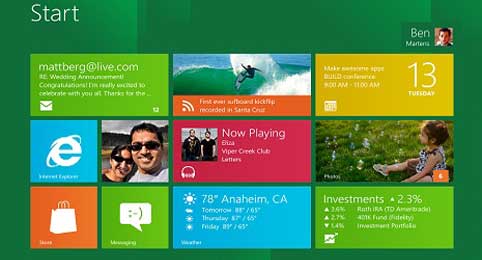
WindOwS 8 is Cool Enough ?

On Tuesday, Microsoft showed off the first tablets running Windows 8, and provided a bunch of new details about the operating system.

Secure Browseing Is The Way To scuess

Go to Blogger edit html and find these sentences.Now replace these sentences with your own descriptions.

Launch Any App Or Script By Moving Mouse Over Left Edge Of Screen [Mac]


The Launchpad utility itself is widely used to group apps, keep them organized and, of course, launch them easily. The only problem with it is that it can quickly get cluttered. Whenever you install an application, a shortcut to the app is added to Launchpad, and these shortcuts need to be moved around to keep things organized. Third party app launchers focus on trying to make it easier to launch your frequently used applications and system utilities. AmbiLauncher Lite is a free Mac app that adds a color spectrum along the left side of the screen. For each corresponding color, you can associate an app or script. When you move your mouse to and back over a color in a boomerang movement of sorts, it launches whichever app or script is associated with that color.
The utility adds an icon (a mouse over a screen) to the menu bar. You can access the app’s preferences and the color sections from this icon. The Peferences allows you to choose the width and opacity of the spectrum and also, how long your mouse should take to complete the gesture required to launch an app.
The preferences window will give you a more accurate idea of the launch gesture. It basically starts from one point, touches the color and makes a U-turn to return to the side of origin.
AmbiLauncher Lite peferences
The Sections window lets you associate apps with colors. You can add colors by clicking the Add Sectionbutton. The color can be changed to any of your own choosing by clicking the color box. To add an application, just drag it over the specified area. If you drop an app icon onto an existing app, it will replace the existing application. To remove an app, simply click Clear App.
Since this is the lite version of the app, the color spectrum only appears on the left side. The full version (costs $2.99) provides color spectrum at bottom, and left & right side of the screen.
Get AmbiLauncher Lite from App Store

Samsung Galaxy S3 prototype shows TouchWiz tweaks to ICS


Yet another Samsung Galaxy S3 prototype has been spotted, and like the last one we saw this model seems to be sporting a disguise. This time, however, there’s a throwback home button tucked below the on-screen Android 4.0 controls  – reminiscent of the one found on the good old Galaxy S2.
But since the design here is probably just a way to keep the GS3 from attracting unwanted attention, it might be more important to look at what’s displayed on the phone’s screen. As you can see, Samsung is at least pondering a prominently-displayed menu button alongside Google’s recommended trio of controls. That runs counter to Google’s official stance, which is that developers should leave the menu button behind and utilize the newer Action Bar instead.
That direction hasn’t been universally well-received by users, however. Many find Google’s removal of the button to be a source of frustration, so it’s possible that Samsung may simply be looking at ways to make their implementation of Android as irritation-free as possible. Just as the case we’re looking at is certainly not Samsung’s final design, the UI shown here could also just be an experiment.
The Galaxy S3 is set to be unveiled at Samsung Mobile Unpacked in about a week, so we’ll know then what Samsung has up its sleeve. Right now, the only thing we really know for certain is that the Galaxy S3 will definitely be the star of the show — it was pegged in the Mobile Unpacked app, which arrived in the Google Play store earlier this week.
More at Phandroid

Newer Posts Older Posts Home

Share

Twitter Delicious Facebook Digg Stumbleupon Favorites More